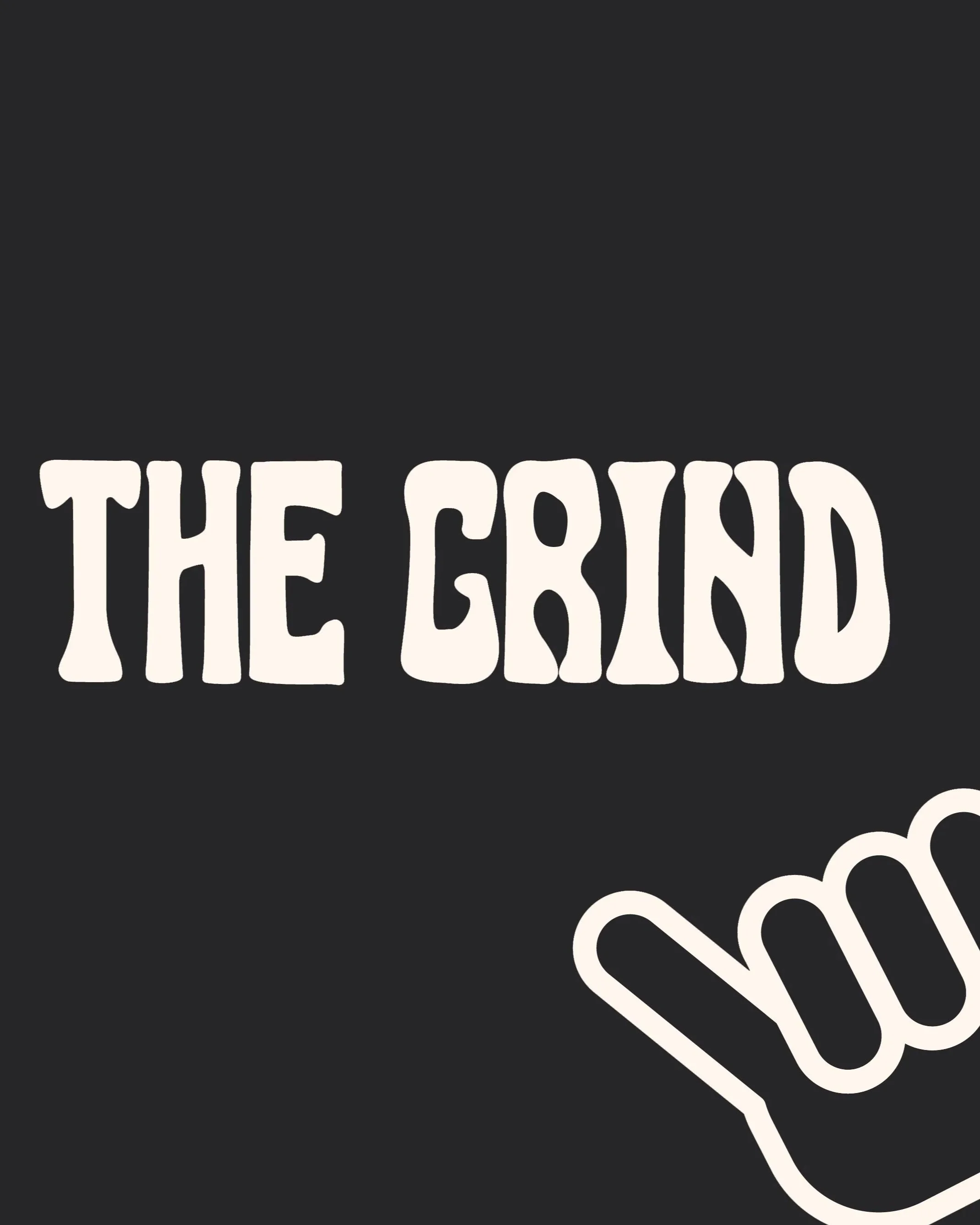
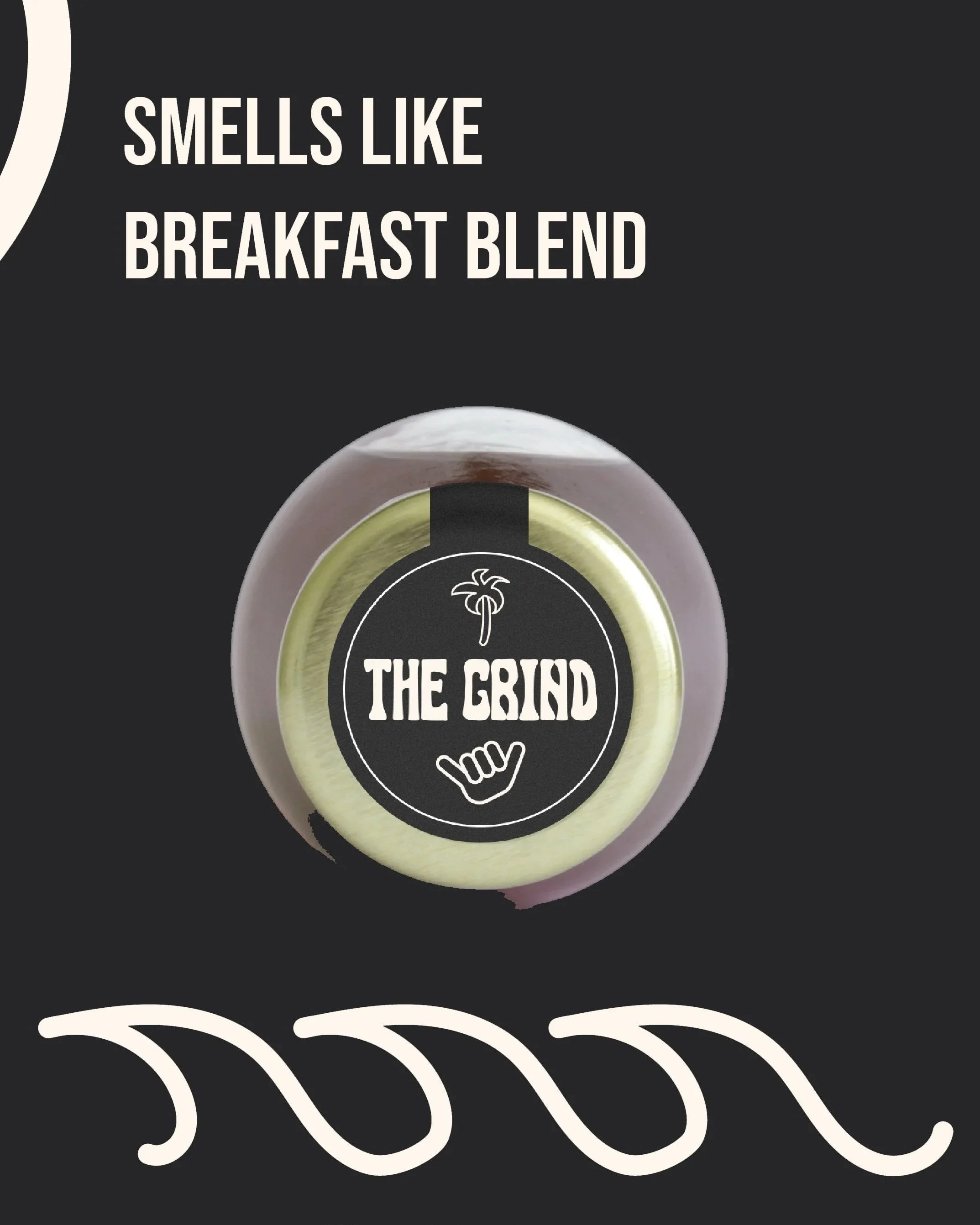
The Grind
The Grind
The Project
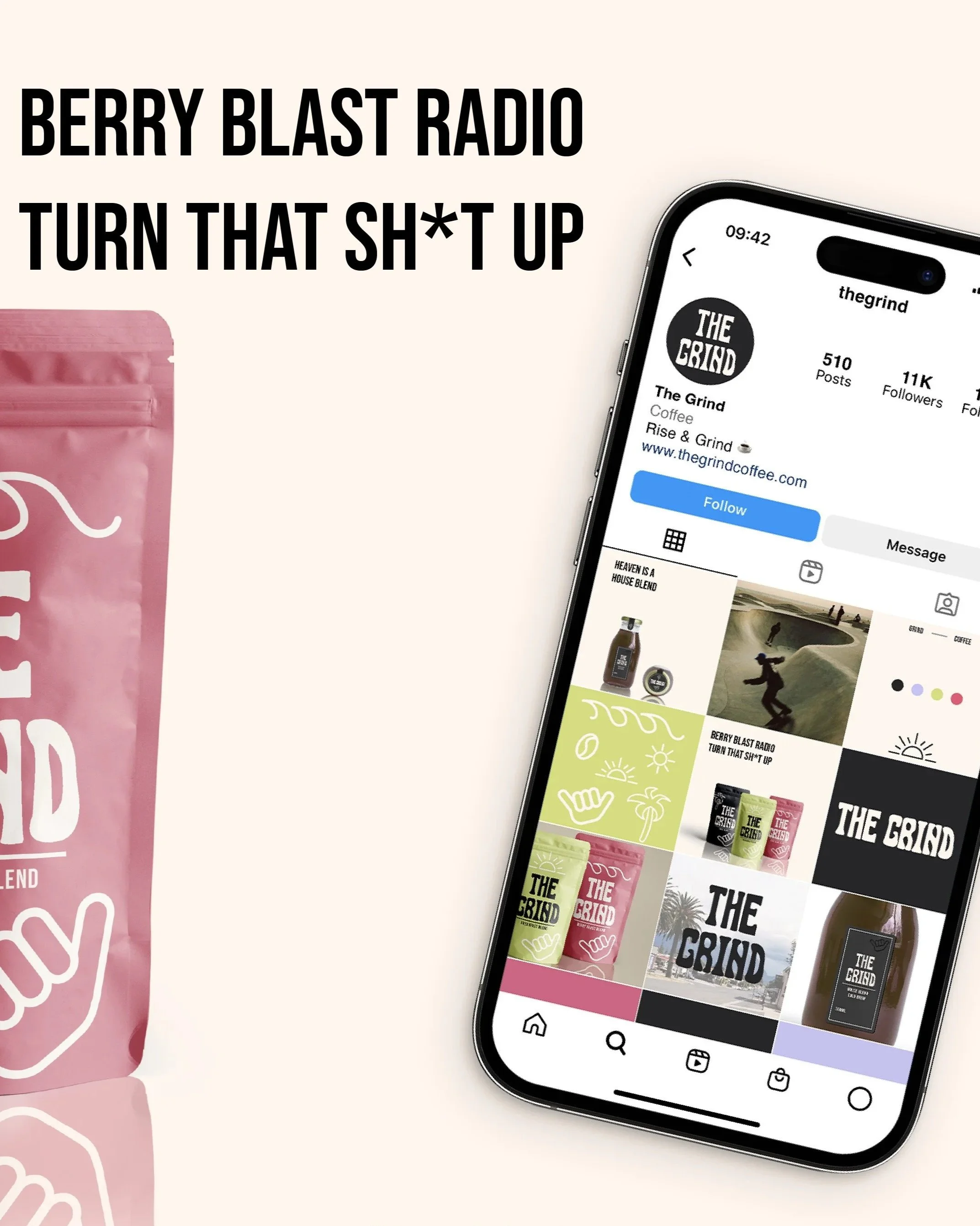
The Grind is an emerging coffee brand serving up the best blends to really wake you the f**k up. With a mission to blend music and caffeine into unique flavours and hauling the cool kids to get out and get grinding. The goal was to design an identity that felt witty, fun and bold.
Every creative choice was made to highlight the brand’s upbeat aesthetics and bold personality, helping The Grind stand out in a heavily saturated market.
The Grind's Heart
Every brand has a heart: its own personality, perspective, and way of saying THIS IS ME. The job of each design is to bring that heart front and centre. Here's some decisions we made based on The Grind's Heart
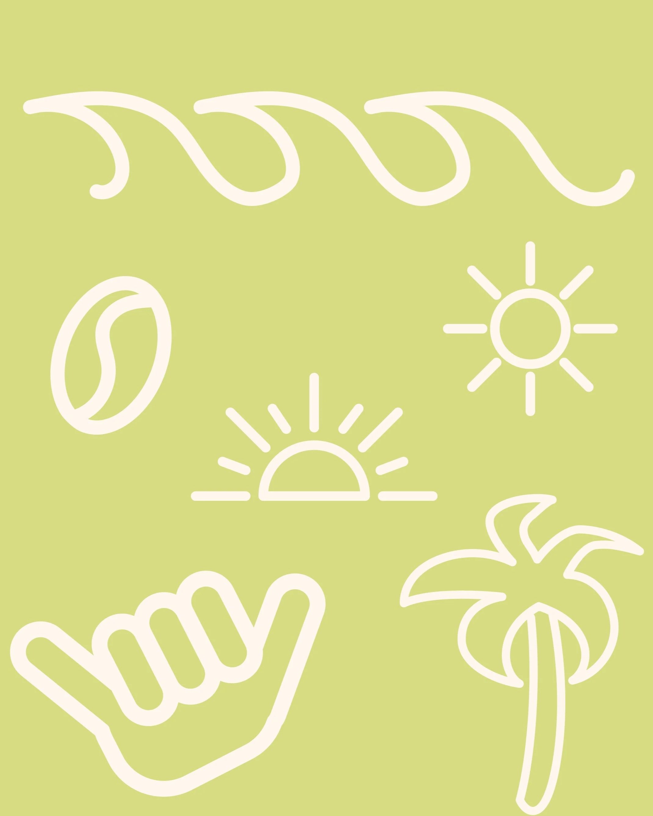
Unique
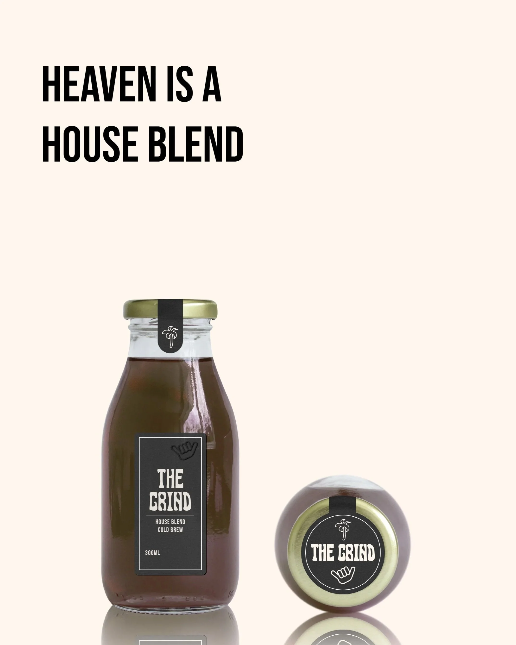
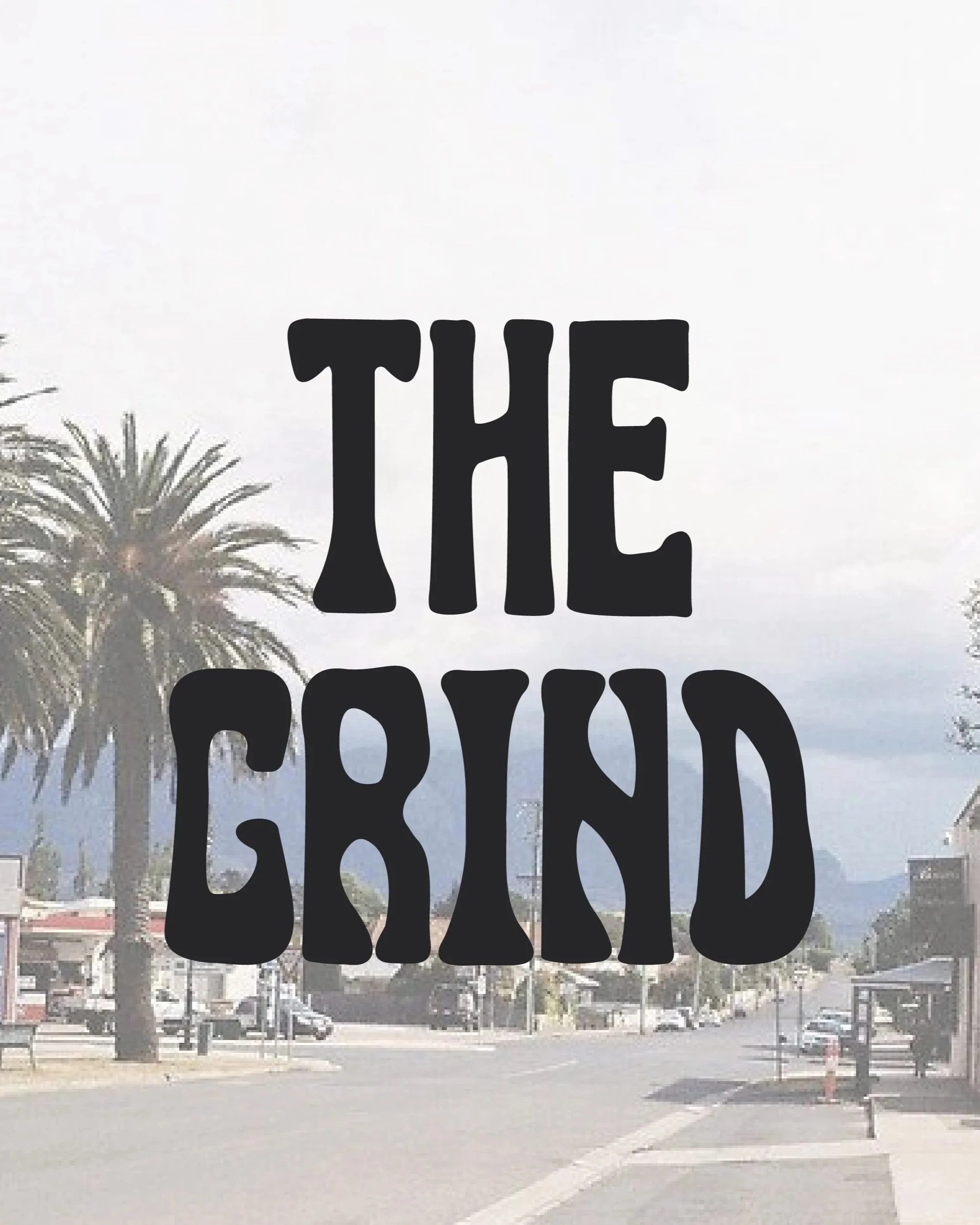
A hand drawn logo was created to give a fun unique feel while still keeping the logo clean and legible.
Bold
Bold hand drawn icons and bright colours work together to showcase this brand's desire to stand out from their competitor.
Witty & Fun
Mixing music reference into their products and advertising the brand connects to their target audience before they've even picked up the product.

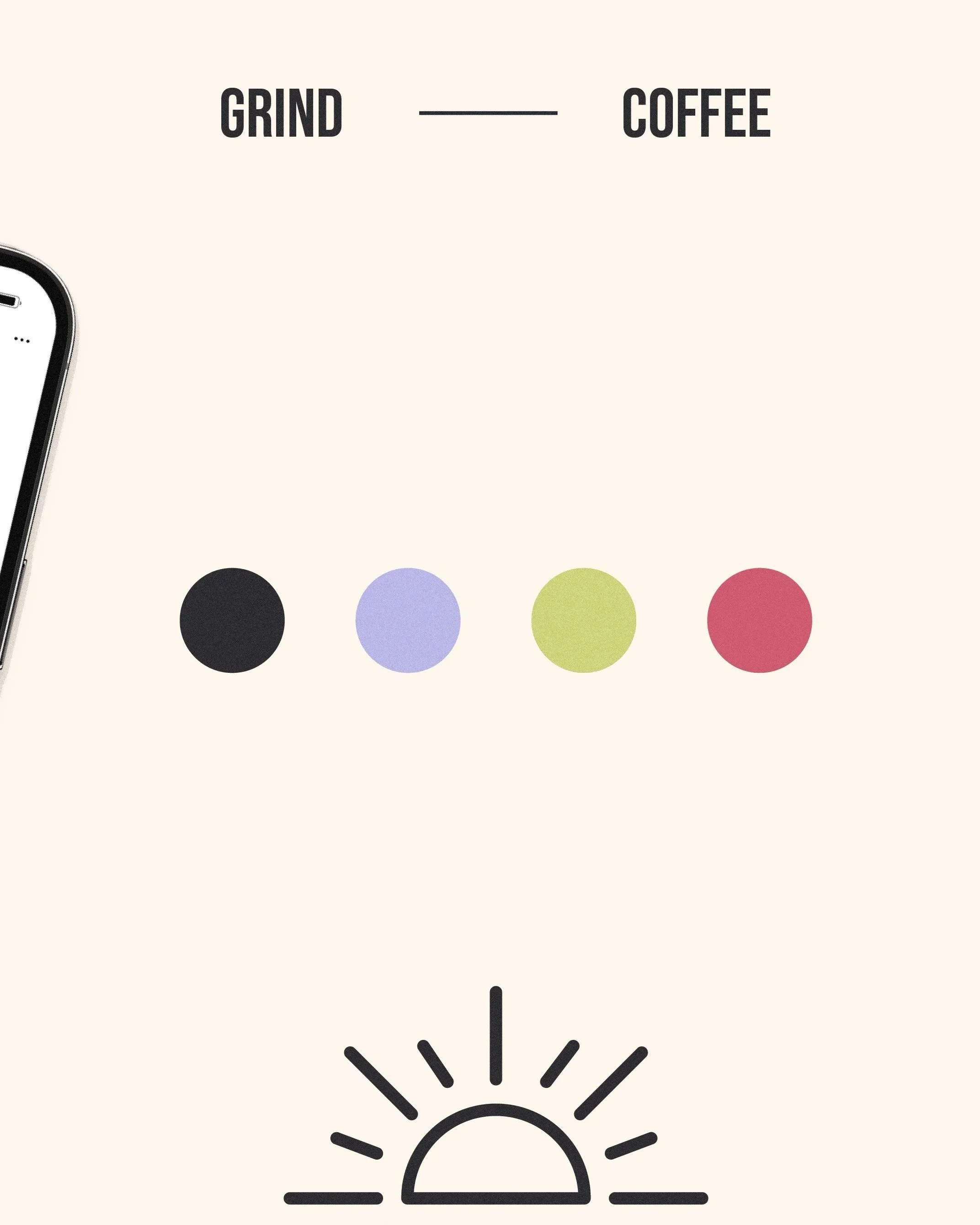
The Colour Palette
The Grind’s palette was designed to feel bold and eye-catching. We used bright green for its high visibility and to communicate energy, paired with berry pink and rich black to add balance.
The palette supports the brand’s bold identity so it doesn’t just look good but it stands out, too.