
Static Push
Static Push
The Project
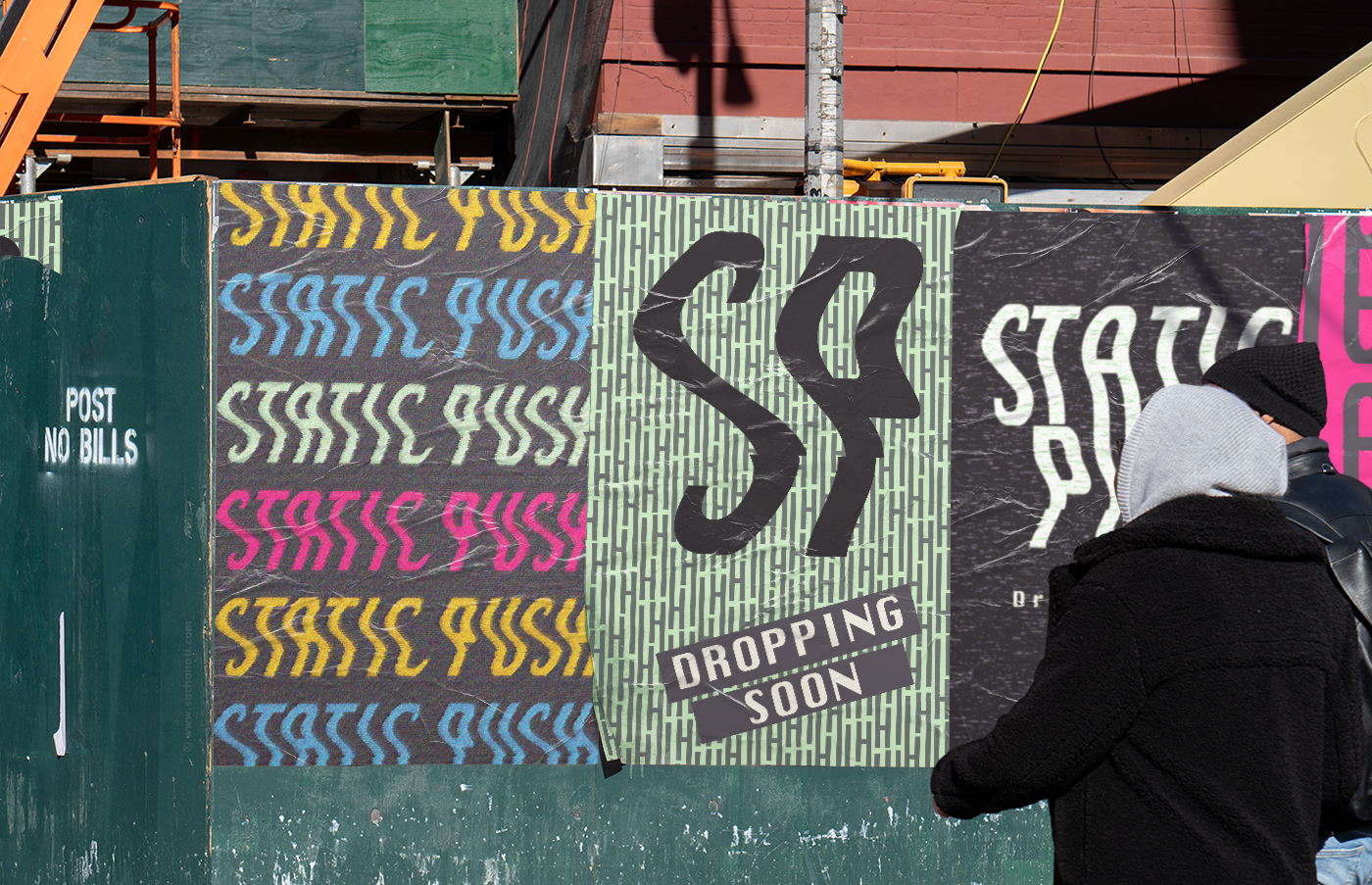
Static Push is a visually uncompromising skate brand that champions independent art. With a mission blend to street-level authenticity, and the intersection of skateboarding and design culture, the goal was to design an identity that felt edgy, rough, and eye-catching.
Every creative choice was made to highlight the brand’s raw aesthetics and bold personality, helping Static Push stand out as leaders in this intersection.
Static Push's Heart
Every brand has a heart: its own personality, perspective, and way of saying THIS IS ME. The job of each design is to bring that heart front and centre. Here's some decisions we made based on Static Push's Heart
Raw & Honest
The whole logo was manipulated to give the feeling of a wavy camcorder while still keeping the logo clean and legible.
Anti Corporate - Pro Expression
Repeating patterns and bright neon work together to balance the expression of art and street culture without becoming too overwhelming.
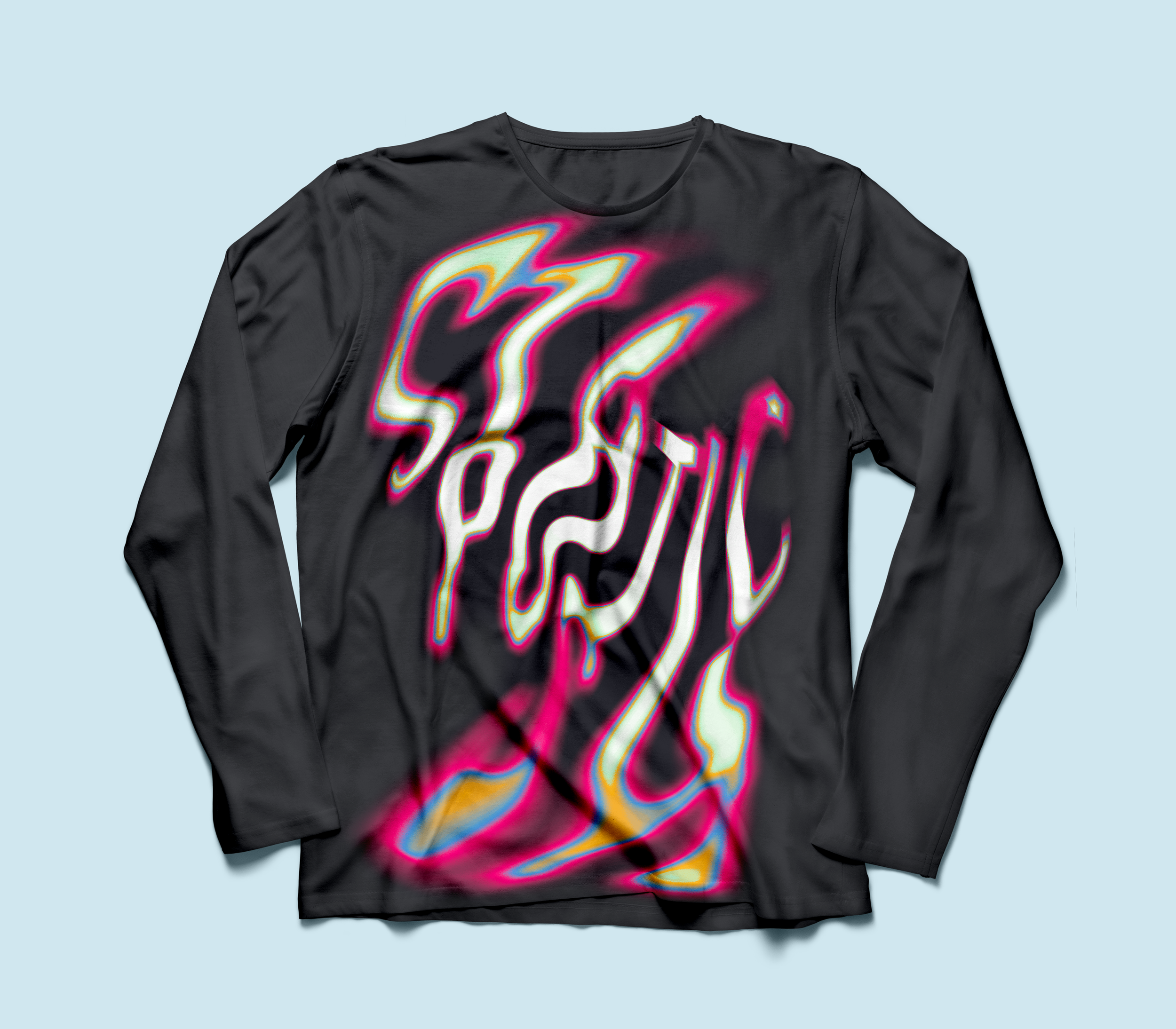

The Colour Palette
Static Push’s palette was designed to feel vibrant and exciting. We used pixel-inspired magenta to communicate non-conformity and energy, paired with bright blues and rich black to add grounding and balance.
The palette supports the brand’s energetic identity so it doesn’t just look good but it excites, too.

